Compo
A Brand in Constant Flux

Issue
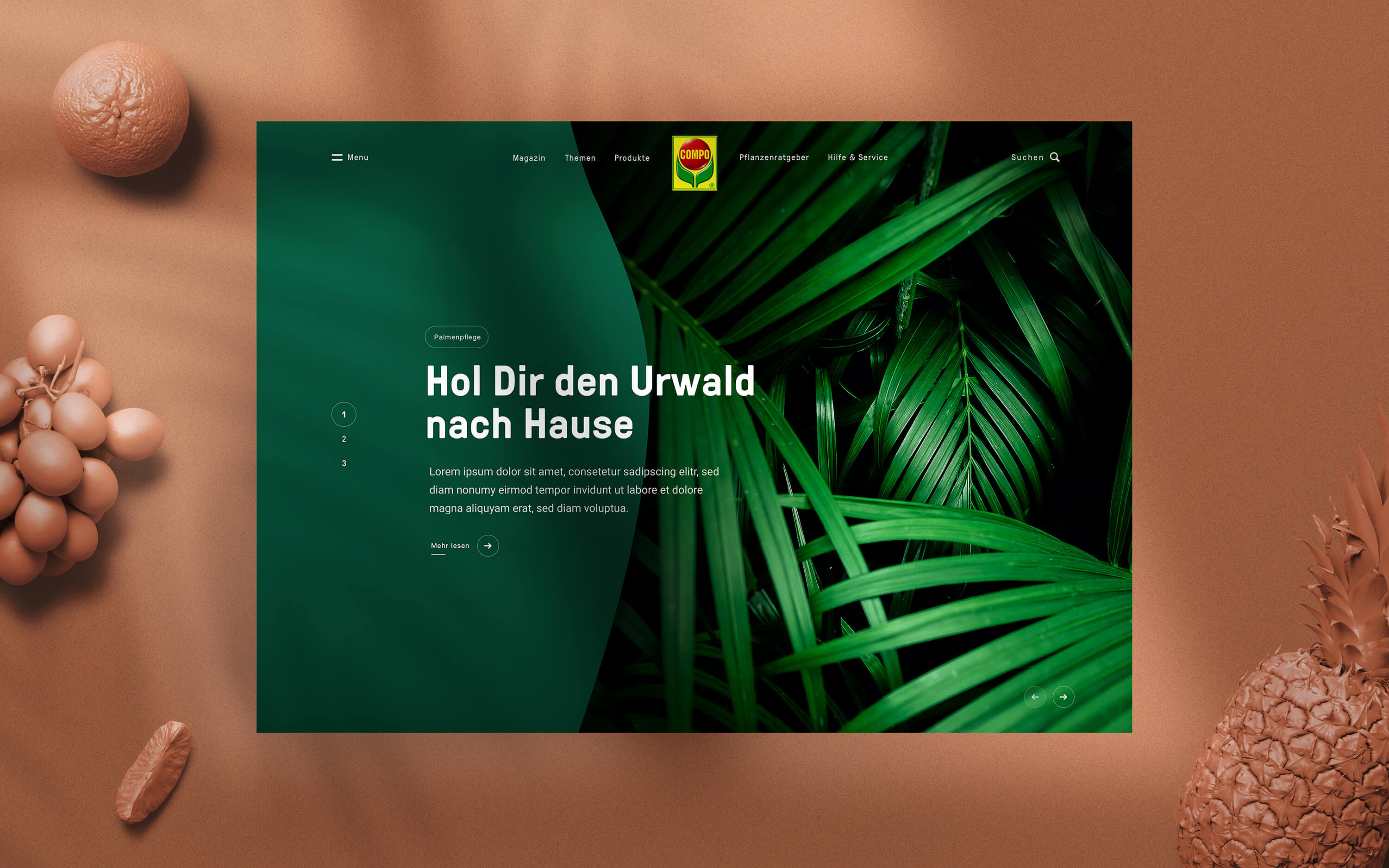
COMPO wanted to grow their customer base. We saw an opportunity in a younger audience. We were assigned to come up with ideas for their digital touchpoints.

Approach
We screened COMPO's existing touchpoints, checked their contents and overall visual coherence and found they lacked recognizability. Also they had no content strategy. They had to evolve if they wanted to close the gap.
Solution
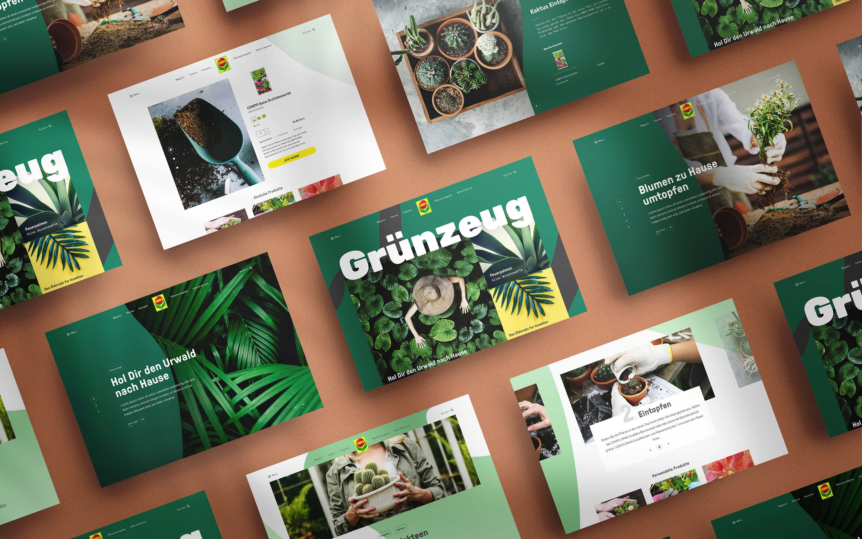
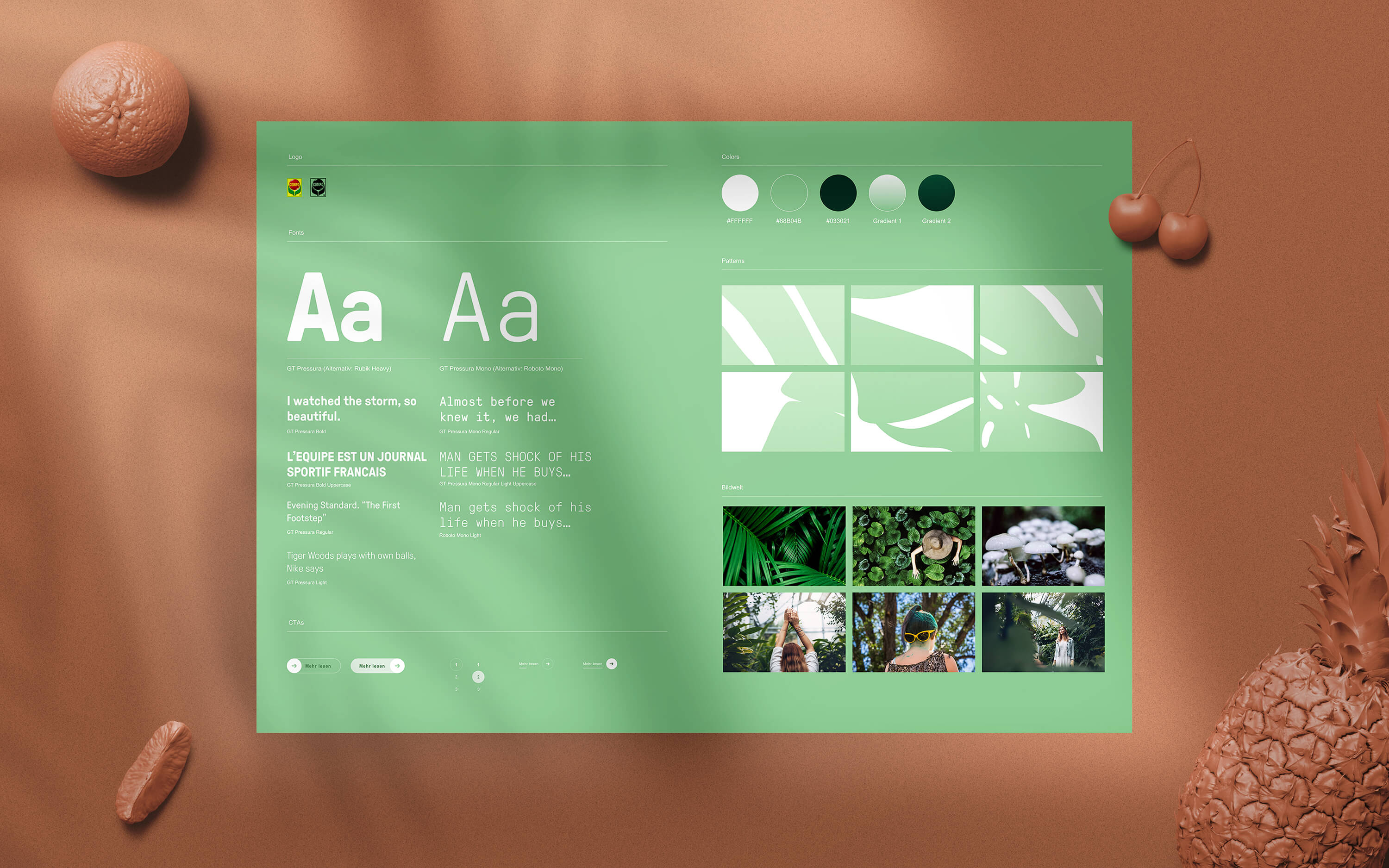
We came up with a brand pattern that consists of adaptive, leaflike structures. I also proposed a new set of fonts and a new image world. Regarding content strategy we went for gardening stories, knowledge and DIY manuals.

Outcome
Unfortunately our proposal was not implemented. From design perspective this still is one of my favourite projects though. To me it proved we could do Branding Digital First. Digital style tiles and a focus on content strategy in favour of brand strategy and classic brand manuals became a formula for me.